

Grids, Geospatial Data, Image Processing, and NetCDF
This discussion is supported by a class20.zip archive provided here. Files in the archive support the analysis of the sandbox activity described below. The week14.zip archive provided here supports the analysis of southern Alaskan earthquakes described at the bottom of this page.
Prior to working with grids, we've been looking at data that been collected from a specific location on Earth. We've used various techniques to treat
that data as a signal so we could find interesting patterns over time. Other approaches look at an entity of
something and track it wherever it goes (e.g. a float floating on open water).
Now we focus on data collected within geospatial extents and how we can prepare that data for analysis and sharing. We cover some useful vocabulary, historical convention, Python data manipulation templates provided as Jupyter notebooks, and examples of analysis. Scientists often store and share data in a raster format.
Data can be collected as part of a modeling exercise. Consider an example of analyzing modeling data for a dramatic weather event called the Pineapple Express in the Pacific Northwest of the United States. Each timestep in the model maintains a grid of variable data for each geographic location being modeled. By coloring each variable, or adding a physical representation of each variable (an arrow for wind direction and intensity), animations of model variable values can be generated for review to make sure the modeling logic is reasonable. Take a look at this archive of such animated videos. In there you will find five Quicktime movies tracking a variable over time.
From left to right in the image here, animations of snow pack, surface moisture, water table, air temperature, and wind velocity are used to analyze the reasonableness of a modeling approach (approximately 106 hours of time pass in each video from start to end). Note that the air temperature and wind velocity are primarily inputs to the model (called drivers or forcing agents) while the other three are outputs from each time step (used then as inputs to the next time step).
After years of improving the model based on known physics of how phenomena behave in the physical environment, time spent in groundtruthing the model with the physical world also validated the approach (but these animations were created very early in the modeling process). The weather event modeled is an extreme event where a warm humid airmass from the direction of Hawaii drops large amounts of rain on the mountains and melts a lot of snow. Those two situations together provide a flood risk as water rushes down the dramatic slopes of the Cascade mountains. Many people live near the waterways that bring that water to Puget Sound in channels (natural and man-made).
Modeling data is a nice way to get comfortable with preparing gridded data for analysis. All the data is procedurally available, manufactured as best as possible from historical data, or hypothetical based on some understanding of the physical world being modeled.
We took eight photos of a simulated terrain created in a sandbox with sand. We had to paint the sand to provide enough texture for the images to capture enough contrast for registration. The eight thumbnail photos seen below are taken at approximately 45 degree intervals when making a revolution around the sandbox. The larger image shows the after-effect of a mass wasting landslide event we created to play with software approaches to estimating the mass of displaced sand.
We brought the photos into the PhotoScanPro software referenced by the blog tutorial. The software provided a big photos pane in which we dragged the photos from a directory listing (we could have used the menuing system to load them as well). PhotoScanPro provides a Workflow menu that makes sure we follow all necessary steps to generating a 3-D model of our terrain height surface. We first aligned the photos, then generated a dense cloud of points the images recognized across at least two photos, then built a mesh of the surface by connecting neighboring points into triangles, and finally exported the surface mesh into a OBJ format since we knew Blender would import that file format and let us investigate and analyze the surface well.
When we imported the OBJ file into Blender we saw a representation of the terrain surface in a 3-D model:
We could then select the model and put Blender into Edit Mode to investigate the surface points and connectivity. Each point that defines the surface of a 3-D model is called a vertex (the plural is vertices), each line segment that connects two vertices is called an edge, and each triangle generated from three close points is called a face. Blender shows us the relative counts existing in the model (as underlined in red, we see there are 85,262 vertices, 255,345 edges, and 170,084 faces generated.
Imagine those points then being ground-truthed (using some random sampling method) on a real terrain to validate the data capture process. We now have height data that is in an triangular irregular network (similar to a TIN methodology used for many scientific processes). Compare that to the regular grid formats we played with following the ASCII ASC grid standard. How would you go about creating such a regular grid out of the data captured here? This is an example of a typical issue scientists have when wanting to share data with each other — they often have different wishes for the data format to suit their analytical process.
The next step would be to repeat the process for capturing the surface after the mass wasting simulation. A discussion of methods to estimate volume loss between two terrain height maps taken at two points in time is here.
Useful vocabulary includes the following:
a raster consists of a matrix of cells (or pixels) organized into rows and columns (or a grid) where each cell contains a value representing information, such as temperature.
Geospatial data is data whereby the x and y dimensions are not generic (1,2,3,4,5) but instead are organized by a numerical system whereby an x dimension value represents east-westness and a y dimension value represents an aspect of south-northness.
Global longitude is a popular unit of measure for the x dimension and global latitude is a popular unit of measure for a unit of longitude, especially for large global datasets.
Getting data into geospatial gridded raster formats sounds basic with those definitions, and it can be more mundane when a well described process is decided upon before the data is collected, but many an ocean data scientist's days have been filled with trying to get data into proper geospatial gridded raster formats so as to facilitate an analysis properly.
Image processing is a huge growing field of processes and procedures followed to make sense of data represented by images. So, over time it has become more and more useful to get data into an image format. We'll focus on getting data into an image tonight and then we'll be able to consider all the useful processes we can apply to an image to do analysis.
NetCDF (Network Common Data Form) is a set of software libraries and self-describing, machine-independent data formats that support the creation, access, and sharing of array-oriented scientific data.
A Hierarchical Data Format (HDF) is a set of file formats (HDF4, HDF5) designed to store and organize large amounts of data. Originally developed at the National Center for Supercomputing Applications, it is supported by The HDF Group.
We are going to use the Python Image Library module, the Python NetCDF tools module, and our own ASCII Gridded Geospatial Data ASC file format reader script to get comfortable processing data from grid to NetCDF file to image and the reverse. Reading the Geospatial Grid into Python variables will prepare us for any CPU computational process that advances our analysis while creating images in a Python friendly environment will prepare us for any GPU computational process that advances our analysis. We'll do this in our familiar Anaconda Jupyter notebook environment.
The global visualization tool demonstrated is available at http://cove.ocean.washington.edu/.
An example of packing grid data into an image with a color ramp (the way too popular rainbow ramp):
and the before and after meshes can be compared top to bottom via (the before is up top; the after is below):
Using Photoshop, we can layer the before and after meshes with some transparency and different colors. Our eyes naturally see red-colored objects in front of blue-colored objects (or any dark color like the black used here):
The OBJ file format we are using to store our mesh data is a text-based format, so we can easily copy and paste the mesh's vertex data from the OBJ file into a spreadsheet. The week 10 archive available at the top of this page contains the resultant spreadsheet of copying the mesh data into a spreadsheet, reorganizing the columns so they represent the east-west, north-south, and value order we have been using in weeks 8 and 9. The value column for the after mesh data is in column D and column E contains a calculation of the difference between columns C and D. The data for north-south and east-west columns have been normalized to range from 0 to 1 as generic relative distances with a note that the extent of the north-south dimension was 1.25x longer than the east-west dimension. We are going to use this data to create a regular grid so we'll want our grid to have a north-south dimension 1.25 times longer in order to keep equal step size in both directions (a requirement of the ASCII ASC grid specification we used in weeks 8 and 9).
The Jupyter notebook included in the week 10 archive (named Height-Change-Analysis.ipynb) includes an analysis approach to determining how much sand was 'wasted' between the before height mesh and the after height mesh. Let's take a look at what that notebook is doing as a series of steps:
1. First we import the tools we'll need to do the analysis. We use the pandas library to read in the CSV file that has been exported from our terrain spreadsheet. We'll use the familiar matplotlib for plotting our data. We use numpy for array generation and array management. And we'll use the scipy interpolation service from the scipy module to create a gridded data set from our triangle-based mesh data.
2. We then read in our data from the CSV file.
3. We need to rearrange that data into formats required by the griddata function scipy provides for gridding non-gridded data. We verify that all 85207 points are being used in the points and values arrays.
4. Numpy provides an mgrid method we can use to set up a grid container that has dimensions 200 columns by 250 rows. This will give us a resultant grid of 50000 points which seems reasonable to interpolate from 85207 points that look to have reasonable coverage from inspecting our meshes in Blender visually. The notebook will let us grid with more resolution. We could quadruple the resolution by doubling the number of columns to 400 and the number of rows to 500. Give it a try later to see the effect on the resulting estimate.
5. We run the griddata method for the before data and the after data to get two data grids. We've worked hard to match the signature of the inputs needed in the previous notebook steps.
6. We then plot the before and after grids to see if the data looks reasonable (comparing it to our mesh images). The difference in height does not look so dramatic with the rainbow color ramp we've chosen (mainly because the table is far below the top of the sand in our image capture and yet is being spanned by the color ramp), but it looks reasonable (see far below).
7. Last, we go through our grids and add up the displaced amount of sand captured in the data at each grid point. We note that a grid point is at the center of an area represented by our data step size squared. So, we can multiple the change in depth at that point by the area to estimate the amount of sand displaced in that grid region. We print out the value of the displaced variable to see the cumulative amount of estimated displaced material.
Things to play with include changing the grid dimensions, changing the color ramp, changing the interpolation technique (choices are nearest, linear, and cubic), and perhaps even playing around with the spreadsheet to displace more material and see the effect on the calculation (just save the spreadsheet as a CSV file and use the file in your notebook). What is the volume of actual displaced sand if the terrain models' dimensions are 14 inches by 17.5 inches?
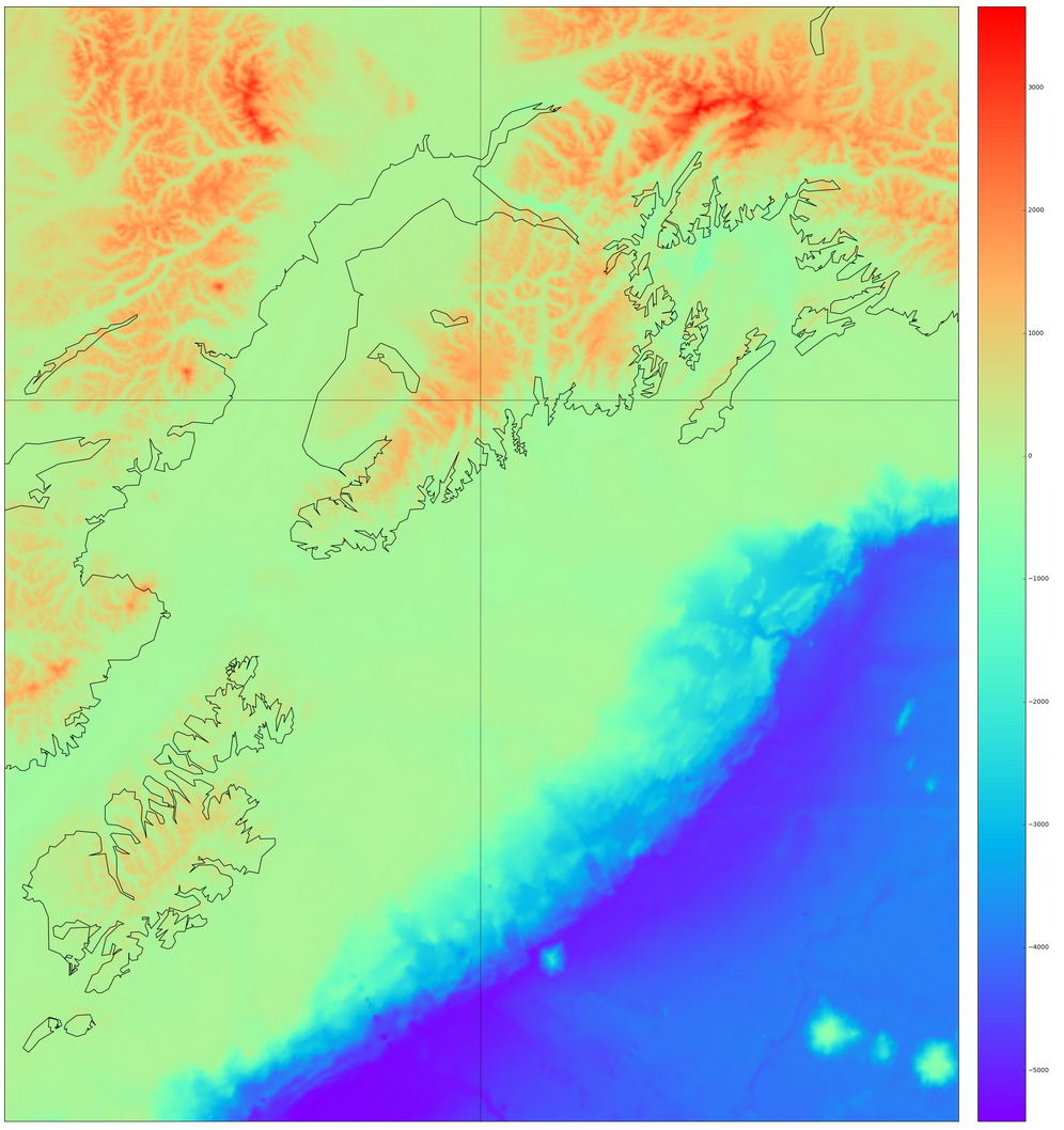
Basemap is provided as a Python service by the basemap and prompt_toolkit modules we installed into the notebook tool via Anaconda. Upon adding the Alaskan coastline, colorbar, and lines of longitude and latitude to the grid plot, we see the result here:
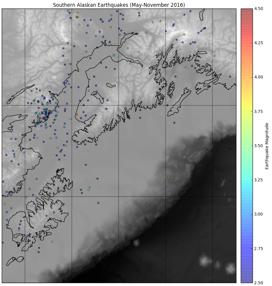
Next we read in the earthquake data provided in the AK_earthquake.csv file using the pandas module we've been using since week 4 in class. We extract the columns from the file by column header name (open the CSV file in a text editor to see the details) and initialize Python numpy arrays for each variable. We call the basemap constructor (via the function m(lonnew, latnew) with the longitude and latitude locations of our earthquake data since we assigned the variable m to the Basemap's declaration), store the construction in x and y variables, and then plot x and y in a scatterplot after generating additional visual features on the underlying basemap using a grayscale colormap. The result is a colored data plot on top of the grayscale base map as seen here:
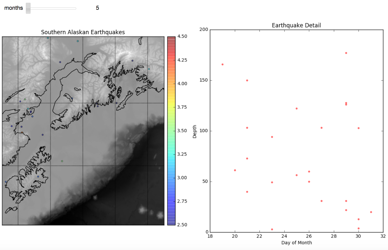
Then we embed the plotting layer within an interpretive interface that lets us analyze one month's worth of data at a time. The code structure is reminiscent of the code we generated to do a step-wise autocorrelation of sea level height in week 7. We create a two-subplot visualization of the plotted month's earthquakes next to a scatter plot comparing day to depth of earthquake. The result for May looks like this here:
Next we start doing some statistical analysis of the Alaska earthquakes data. The scatter plots with trend lines and histogram with normal curve overlay use notebook code from weeks 4 and 5 of class. The visuals we create look like this:
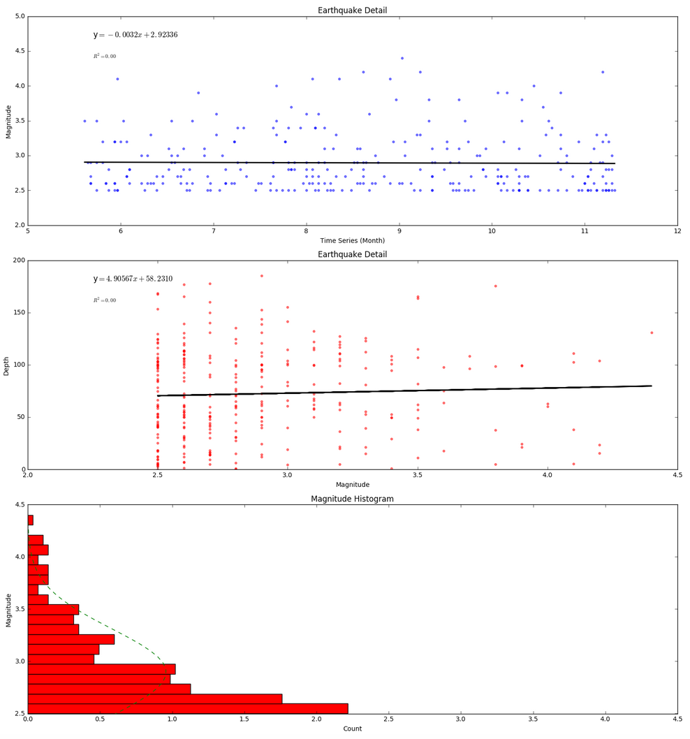
The trendlines are not very impressive as they show only a small decrease in earthquake magnitude over time (a .0032 decrease) and only a small 4.90567 kilometer increase in depth based on magnitude (independent of time). Even if these trendlines were more dramatic, neither of these trendlines would be worth much when no R-squared correlation has been found among variables.
The histogram shows that many more low magnitude earthquakes took place than high magnitude earthquakes during the time period of the data. We can assume that earthquakes below 2.5 were not included in the data set so we cannot really say much as to wheter a normal distribution applies (though we would doubt it based on a basic understanding of earthquakes behavior). In the absense of evidence to the contrary, we're thinking the histogram would continue to get wider for lower magnitudes.
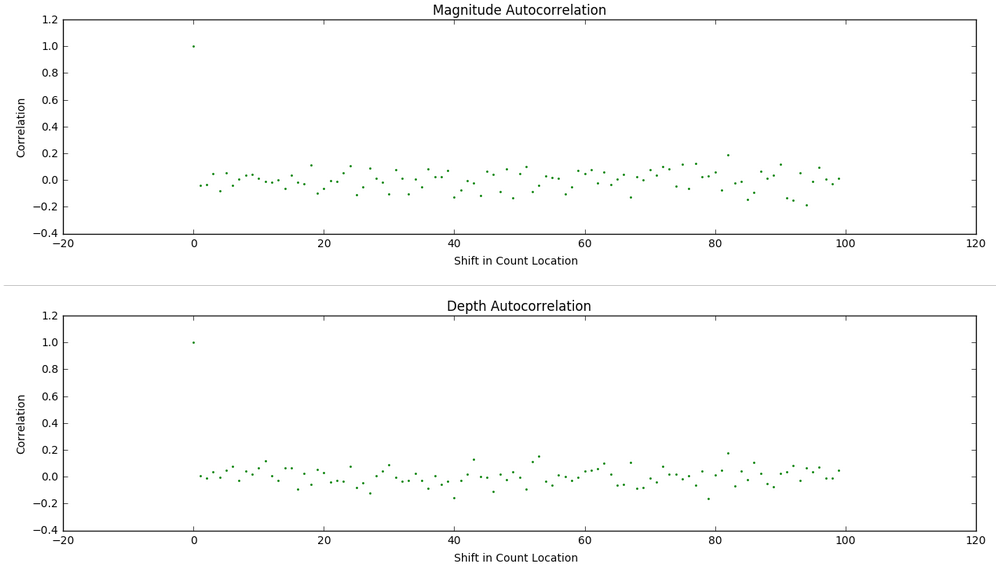
We then perform an investigation of repetitive patterns in the data via an autocorrelation technique we looked at during weeks 5 and 6 in class. The results seen below suggest there isn't much of a repeating pattern for magitude or depth based on the order in which earthquakes take place in time within the dataset.
Now we focus on data collected within geospatial extents and how we can prepare that data for analysis and sharing. We cover some useful vocabulary, historical convention, Python data manipulation templates provided as Jupyter notebooks, and examples of analysis. Scientists often store and share data in a raster format.
Data can be collected as part of a modeling exercise. Consider an example of analyzing modeling data for a dramatic weather event called the Pineapple Express in the Pacific Northwest of the United States. Each timestep in the model maintains a grid of variable data for each geographic location being modeled. By coloring each variable, or adding a physical representation of each variable (an arrow for wind direction and intensity), animations of model variable values can be generated for review to make sure the modeling logic is reasonable. Take a look at this archive of such animated videos. In there you will find five Quicktime movies tracking a variable over time.
From left to right in the image here, animations of snow pack, surface moisture, water table, air temperature, and wind velocity are used to analyze the reasonableness of a modeling approach (approximately 106 hours of time pass in each video from start to end). Note that the air temperature and wind velocity are primarily inputs to the model (called drivers or forcing agents) while the other three are outputs from each time step (used then as inputs to the next time step).
After years of improving the model based on known physics of how phenomena behave in the physical environment, time spent in groundtruthing the model with the physical world also validated the approach (but these animations were created very early in the modeling process). The weather event modeled is an extreme event where a warm humid airmass from the direction of Hawaii drops large amounts of rain on the mountains and melts a lot of snow. Those two situations together provide a flood risk as water rushes down the dramatic slopes of the Cascade mountains. Many people live near the waterways that bring that water to Puget Sound in channels (natural and man-made).
Modeling data is a nice way to get comfortable with preparing gridded data for analysis. All the data is procedurally available, manufactured as best as possible from historical data, or hypothetical based on some understanding of the physical world being modeled.
Sandbox Remote Sensing Exercise
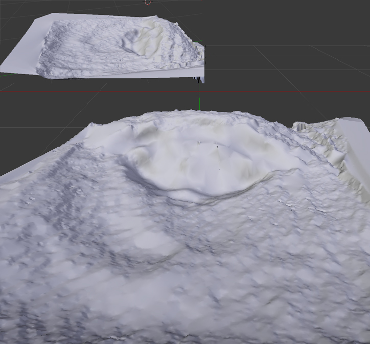
Besides grid data generated in modeling use, grid data often comes from sensing the physical world to capture data in ways it can be stored in a grid. In class we look at a simulated remote sensing process used to capture a digital elevation model of a terrain (or, if under water, called a bathymetry). We play around with an exercise based upon scanning the world photogrammetrically with a smartphone.We took eight photos of a simulated terrain created in a sandbox with sand. We had to paint the sand to provide enough texture for the images to capture enough contrast for registration. The eight thumbnail photos seen below are taken at approximately 45 degree intervals when making a revolution around the sandbox. The larger image shows the after-effect of a mass wasting landslide event we created to play with software approaches to estimating the mass of displaced sand.
We brought the photos into the PhotoScanPro software referenced by the blog tutorial. The software provided a big photos pane in which we dragged the photos from a directory listing (we could have used the menuing system to load them as well). PhotoScanPro provides a Workflow menu that makes sure we follow all necessary steps to generating a 3-D model of our terrain height surface. We first aligned the photos, then generated a dense cloud of points the images recognized across at least two photos, then built a mesh of the surface by connecting neighboring points into triangles, and finally exported the surface mesh into a OBJ format since we knew Blender would import that file format and let us investigate and analyze the surface well.
When we imported the OBJ file into Blender we saw a representation of the terrain surface in a 3-D model:
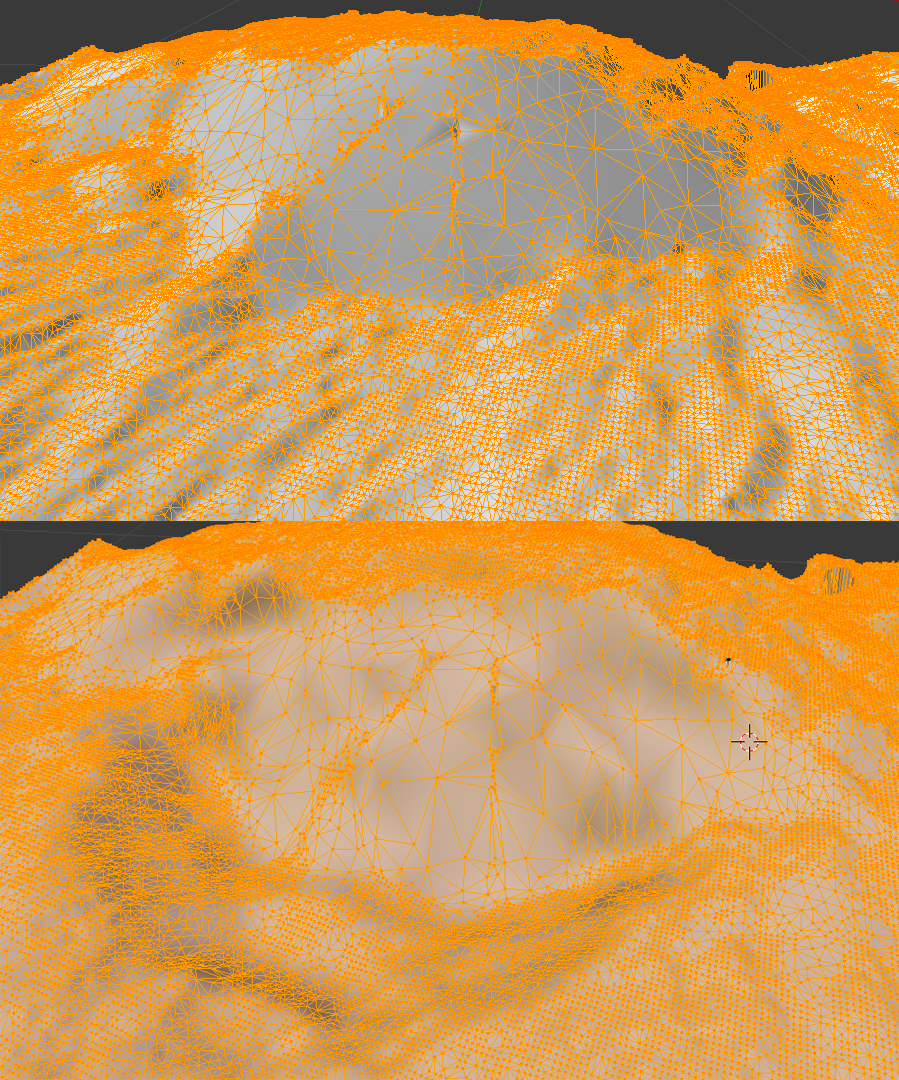
We could then select the model and put Blender into Edit Mode to investigate the surface points and connectivity. Each point that defines the surface of a 3-D model is called a vertex (the plural is vertices), each line segment that connects two vertices is called an edge, and each triangle generated from three close points is called a face. Blender shows us the relative counts existing in the model (as underlined in red, we see there are 85,262 vertices, 255,345 edges, and 170,084 faces generated.
Imagine those points then being ground-truthed (using some random sampling method) on a real terrain to validate the data capture process. We now have height data that is in an triangular irregular network (similar to a TIN methodology used for many scientific processes). Compare that to the regular grid formats we played with following the ASCII ASC grid standard. How would you go about creating such a regular grid out of the data captured here? This is an example of a typical issue scientists have when wanting to share data with each other — they often have different wishes for the data format to suit their analytical process.
The next step would be to repeat the process for capturing the surface after the mass wasting simulation. A discussion of methods to estimate volume loss between two terrain height maps taken at two points in time is here.
Useful vocabulary includes the following:
a raster consists of a matrix of cells (or pixels) organized into rows and columns (or a grid) where each cell contains a value representing information, such as temperature.
Geospatial data is data whereby the x and y dimensions are not generic (1,2,3,4,5) but instead are organized by a numerical system whereby an x dimension value represents east-westness and a y dimension value represents an aspect of south-northness.
Global longitude is a popular unit of measure for the x dimension and global latitude is a popular unit of measure for a unit of longitude, especially for large global datasets.
Getting data into geospatial gridded raster formats sounds basic with those definitions, and it can be more mundane when a well described process is decided upon before the data is collected, but many an ocean data scientist's days have been filled with trying to get data into proper geospatial gridded raster formats so as to facilitate an analysis properly.
Image processing is a huge growing field of processes and procedures followed to make sense of data represented by images. So, over time it has become more and more useful to get data into an image format. We'll focus on getting data into an image tonight and then we'll be able to consider all the useful processes we can apply to an image to do analysis.
NetCDF (Network Common Data Form) is a set of software libraries and self-describing, machine-independent data formats that support the creation, access, and sharing of array-oriented scientific data.
A Hierarchical Data Format (HDF) is a set of file formats (HDF4, HDF5) designed to store and organize large amounts of data. Originally developed at the National Center for Supercomputing Applications, it is supported by The HDF Group.
We are going to use the Python Image Library module, the Python NetCDF tools module, and our own ASCII Gridded Geospatial Data ASC file format reader script to get comfortable processing data from grid to NetCDF file to image and the reverse. Reading the Geospatial Grid into Python variables will prepare us for any CPU computational process that advances our analysis while creating images in a Python friendly environment will prepare us for any GPU computational process that advances our analysis. We'll do this in our familiar Anaconda Jupyter notebook environment.
The global visualization tool demonstrated is available at http://cove.ocean.washington.edu/.
An example of packing grid data into an image with a color ramp (the way too popular rainbow ramp):
#Use the Python Image Library to create an image
from PIL import Image, ImageDraw
import math

img = Image.new( 'RGB', (len(lons),len(lats)), "black") # create a new black image
pixels = img.load() # create the pixel map
ff = 255
r = -1
g = -1
b = -1

for i in range(len(lats)):    # for every pixel:
    for j in range(len(lons)):
        mapped = (alt2D[i][j] - min_alt)/(max_alt - min_alt + 1) * 6
        whole = int(mapped)
        decimal = int((mapped - whole) * 255)
        #use a rainbow mapping of data to take advantage of all 3 image channels
        if(whole < 1):
            r = ff
            g = decimal
            b = 0
        if(whole < 2 and whole >= 1):
            r = ff - decimal
            g = ff
            b = 0;
        if(whole < 3 and whole >= 2):
            r = 0
            g = ff
            b = decimal
        if(whole < 4 and whole >= 3):
            r = 0
            g = ff - decimal
            b = ff
        if(whole < 5 and whole >= 4):
            r = decimal
            g = 0
            b = ff
        if(whole >=5):
            r = ff
            g = 0
            b = ff - decimal
        pixels[j,i] = (r, g, b) # set the color accordingly
img.show()
Analysis of terrain change
We next repeat the steps we performed on our beginning height map from an image analysis of our sandbox, but with the images taken of the after state of the sandbox. We use software to align our eight after-images, create a point cloud of points on the surface that the software feels confident actually exist, create a mesh of triangles from that point cloud, and then export the mesh as an .OBJ file so we can bring the mesh into Blender for analysis. The after mesh looks like:
and the before and after meshes can be compared top to bottom via (the before is up top; the after is below):
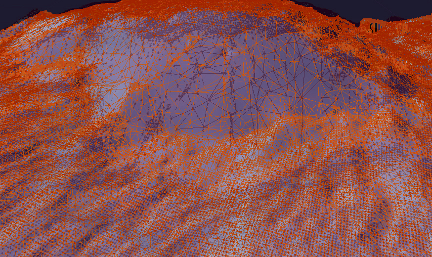
Using Photoshop, we can layer the before and after meshes with some transparency and different colors. Our eyes naturally see red-colored objects in front of blue-colored objects (or any dark color like the black used here):
The OBJ file format we are using to store our mesh data is a text-based format, so we can easily copy and paste the mesh's vertex data from the OBJ file into a spreadsheet. The week 10 archive available at the top of this page contains the resultant spreadsheet of copying the mesh data into a spreadsheet, reorganizing the columns so they represent the east-west, north-south, and value order we have been using in weeks 8 and 9. The value column for the after mesh data is in column D and column E contains a calculation of the difference between columns C and D. The data for north-south and east-west columns have been normalized to range from 0 to 1 as generic relative distances with a note that the extent of the north-south dimension was 1.25x longer than the east-west dimension. We are going to use this data to create a regular grid so we'll want our grid to have a north-south dimension 1.25 times longer in order to keep equal step size in both directions (a requirement of the ASCII ASC grid specification we used in weeks 8 and 9).
The Jupyter notebook included in the week 10 archive (named Height-Change-Analysis.ipynb) includes an analysis approach to determining how much sand was 'wasted' between the before height mesh and the after height mesh. Let's take a look at what that notebook is doing as a series of steps:
1. First we import the tools we'll need to do the analysis. We use the pandas library to read in the CSV file that has been exported from our terrain spreadsheet. We'll use the familiar matplotlib for plotting our data. We use numpy for array generation and array management. And we'll use the scipy interpolation service from the scipy module to create a gridded data set from our triangle-based mesh data.
2. We then read in our data from the CSV file.
3. We need to rearrange that data into formats required by the griddata function scipy provides for gridding non-gridded data. We verify that all 85207 points are being used in the points and values arrays.
4. Numpy provides an mgrid method we can use to set up a grid container that has dimensions 200 columns by 250 rows. This will give us a resultant grid of 50000 points which seems reasonable to interpolate from 85207 points that look to have reasonable coverage from inspecting our meshes in Blender visually. The notebook will let us grid with more resolution. We could quadruple the resolution by doubling the number of columns to 400 and the number of rows to 500. Give it a try later to see the effect on the resulting estimate.
5. We run the griddata method for the before data and the after data to get two data grids. We've worked hard to match the signature of the inputs needed in the previous notebook steps.
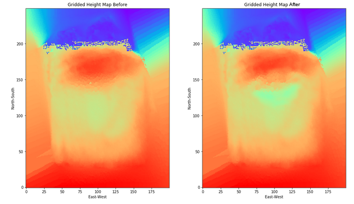
6. We then plot the before and after grids to see if the data looks reasonable (comparing it to our mesh images). The difference in height does not look so dramatic with the rainbow color ramp we've chosen (mainly because the table is far below the top of the sand in our image capture and yet is being spanned by the color ramp), but it looks reasonable (see far below).
7. Last, we go through our grids and add up the displaced amount of sand captured in the data at each grid point. We note that a grid point is at the center of an area represented by our data step size squared. So, we can multiple the change in depth at that point by the area to estimate the amount of sand displaced in that grid region. We print out the value of the displaced variable to see the cumulative amount of estimated displaced material.
Things to play with include changing the grid dimensions, changing the color ramp, changing the interpolation technique (choices are nearest, linear, and cubic), and perhaps even playing around with the spreadsheet to displace more material and see the effect on the calculation (just save the spreadsheet as a CSV file and use the file in your notebook). What is the volume of actual displaced sand if the terrain models' dimensions are 14 inches by 17.5 inches?
Analysis of southern Alaskan earthquakes
The week 14 archive contains the files used to do an analysis of southern Alaskan earthquakes described in the following. The Analyze_Alaska_Earthquakes.ipynb notebook uses components of analysis and visualization from prior weeks in the course. First, the AK_topo.asc ASCII grid file is read into variables that are plotted using matplotlib.pyplot. We reviewed that code in week 10 of class. We then used the Basemap features provided in week 13 to add useful visual additions to the two-dimensional plot (a map of sorts).Basemap is provided as a Python service by the basemap and prompt_toolkit modules we installed into the notebook tool via Anaconda. Upon adding the Alaskan coastline, colorbar, and lines of longitude and latitude to the grid plot, we see the result here:
Next we read in the earthquake data provided in the AK_earthquake.csv file using the pandas module we've been using since week 4 in class. We extract the columns from the file by column header name (open the CSV file in a text editor to see the details) and initialize Python numpy arrays for each variable. We call the basemap constructor (via the function m(lonnew, latnew) with the longitude and latitude locations of our earthquake data since we assigned the variable m to the Basemap's declaration), store the construction in x and y variables, and then plot x and y in a scatterplot after generating additional visual features on the underlying basemap using a grayscale colormap. The result is a colored data plot on top of the grayscale base map as seen here:
Then we embed the plotting layer within an interpretive interface that lets us analyze one month's worth of data at a time. The code structure is reminiscent of the code we generated to do a step-wise autocorrelation of sea level height in week 7. We create a two-subplot visualization of the plotted month's earthquakes next to a scatter plot comparing day to depth of earthquake. The result for May looks like this here:
Next we start doing some statistical analysis of the Alaska earthquakes data. The scatter plots with trend lines and histogram with normal curve overlay use notebook code from weeks 4 and 5 of class. The visuals we create look like this:
The trendlines are not very impressive as they show only a small decrease in earthquake magnitude over time (a .0032 decrease) and only a small 4.90567 kilometer increase in depth based on magnitude (independent of time). Even if these trendlines were more dramatic, neither of these trendlines would be worth much when no R-squared correlation has been found among variables.
The histogram shows that many more low magnitude earthquakes took place than high magnitude earthquakes during the time period of the data. We can assume that earthquakes below 2.5 were not included in the data set so we cannot really say much as to wheter a normal distribution applies (though we would doubt it based on a basic understanding of earthquakes behavior). In the absense of evidence to the contrary, we're thinking the histogram would continue to get wider for lower magnitudes.
We then perform an investigation of repetitive patterns in the data via an autocorrelation technique we looked at during weeks 5 and 6 in class. The results seen below suggest there isn't much of a repeating pattern for magitude or depth based on the order in which earthquakes take place in time within the dataset.