

Class on April 17 2018
Rob provided a plankton analysis data file, in CSV format, that contained data
obtained during a long program of continental shelf-wide
plankton survey cruises. Rob introduced the data and some initial analysis techniques that are relevant to that genre of data
file. The file includes over 200 plankton related variables for comparative analysis.
Students then worked on their own analyses give the wide variety of variables present in the data for each location the cruise
visited during data collection. Scatterplots provide good overviews of plankton characteristics. Plotting copepoda counts versus
temperature and salinity provide the two subplots here:
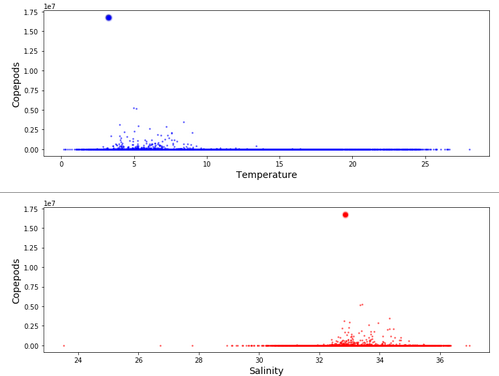
Looking at temperature, the larger plankton finds were between 3 and 9 degrees Centigrade, with an outlier large find at 4 degrees. Looking at Salinity, the larger plankton finds were between 32 and 35 ppt, with the outlier large find at 32.6 ppt.
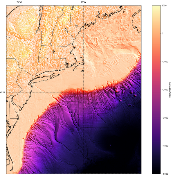
After doing a scatterplot of latitude v. longitude to find the data set bounds, and creating a GRD topo file following the process of April 10th, we could create a basemap using the mpl toolkits Basemap module. The map below is created using the script segement here:
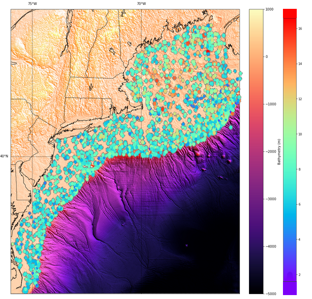
A layer of all the copepoda count data from 1977 to 2015 can then be georeferenced on top of the basemap, showing the surface location clearly for each sample:
To get a simple presentation of plankton sample counts by sample year, we run a loop to create separate scatterplots for each year between 1977 and 2015 (the years in the data).
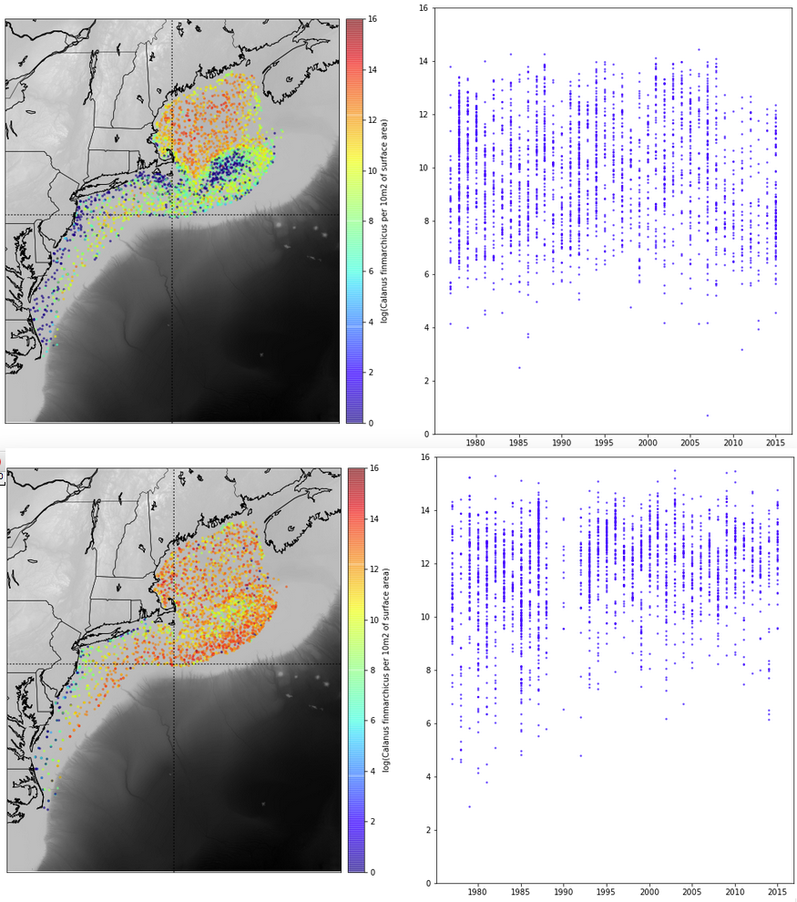
Using a similar approach of slicing time, using month instead of year, we were able to do a comparison of plankton distribution by month for the calfin variable. The image below looks at April (on top) versus October (on bottom):
Looking at temperature, the larger plankton finds were between 3 and 9 degrees Centigrade, with an outlier large find at 4 degrees. Looking at Salinity, the larger plankton finds were between 32 and 35 ppt, with the outlier large find at 32.6 ppt.
After doing a scatterplot of latitude v. longitude to find the data set bounds, and creating a GRD topo file following the process of April 10th, we could create a basemap using the mpl toolkits Basemap module. The map below is created using the script segement here:
m = Basemap(projection='merc',llcrnrlat= 35.0, urcrnrlat=45.0, llcrnrlon=-76.0, urcrnrlon=-65.5,
            lat_ts=20, resolution='i')
m.imshow(rgb, vmin=-5000 , vmax = 1000)
m.drawcoastlines()
m.drawstates()
m.drawcountries()
m.drawparallels(np.arange(-90.,91.,5.),labels=[True,False,True,True])
m.drawmeridians(np.arange(-180.,181.,5.),labels=[False,True,True,False])
A layer of all the copepoda count data from 1977 to 2015 can then be georeferenced on top of the basemap, showing the surface location clearly for each sample:
To get a simple presentation of plankton sample counts by sample year, we run a loop to create separate scatterplots for each year between 1977 and 2015 (the years in the data).
for start_K in range (1977, 2016):
    pick_range = data_df.loc[(data_df['year']==start_K)] # Extract only good data

    #Extract plankton and X, Y values for data subset
    DE = pick_range['larvaceans_10m2']
    XE = pick_range['lon']
    YE = pick_range['lat']

    figure = plt.figure(figsize=(20, 16))
    figure.add_subplot(1, 1, 1, axisbg='gray')

    plt.scatter(XE, YE, c=np.log(DE), cmap="rainbow", s=(10*np.log(DE))-8, alpha=1.0)
    plt.colorbar()

    plt.xlabel("Lons", fontsize=14)
    plt.ylabel("Lats", fontsize=14)

    plt.show()
    plt.savefig("larvae" + str(start_K) + ".png")
Stiching them together sequentially and adding a time marker, we get the video below:
Using a similar approach of slicing time, using month instead of year, we were able to do a comparison of plankton distribution by month for the calfin variable. The image below looks at April (on top) versus October (on bottom):