

Class on March 1 2018
Rob kicked off class with a discussion of data formatting for critter population counts at three layers of
depth in the water column. Students each shared the formatting they had done for homework. Two of the four
students had come up with an approach similar to Rob's and thus the class proceeded with
that format.
With the formatted data, Rob asked students to work individually or in a group to write Python code in a Jupyter notebook in order to create line graphs of population counts by depth layer over time.
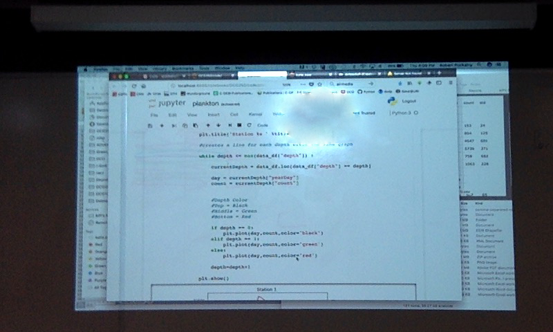
Mike came up with a concise, elegant, and efficient routing to create the line graphs. He provided an overview of his solution in class and answered questions facilitated by Rob:
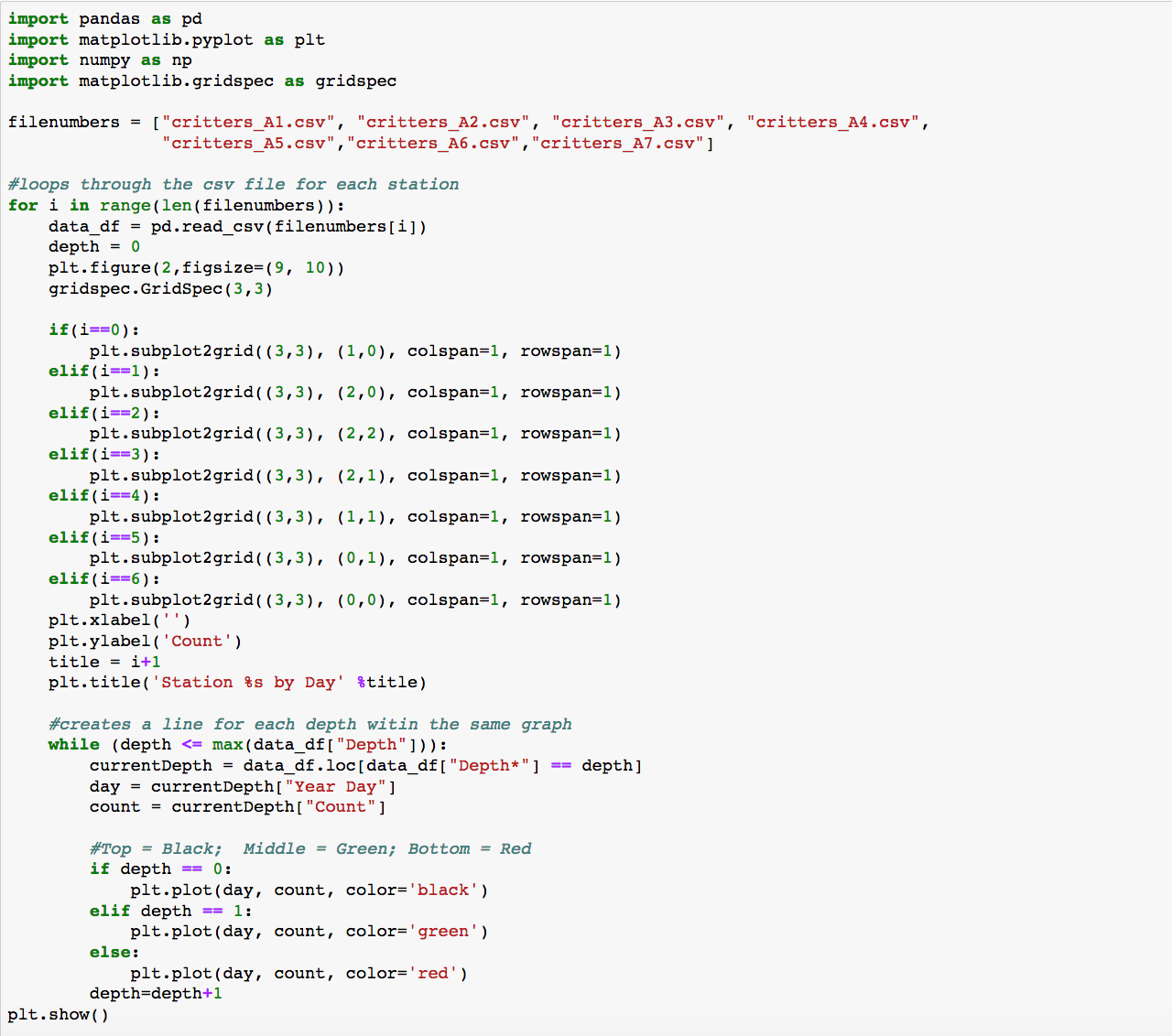
Rob then asked everyone in class to work on arranging the seven location subplot line graphs into a gridded structure that would show the plots in a rough estimation of relative geospatial location to each other. Code that worked to that effect looks like:
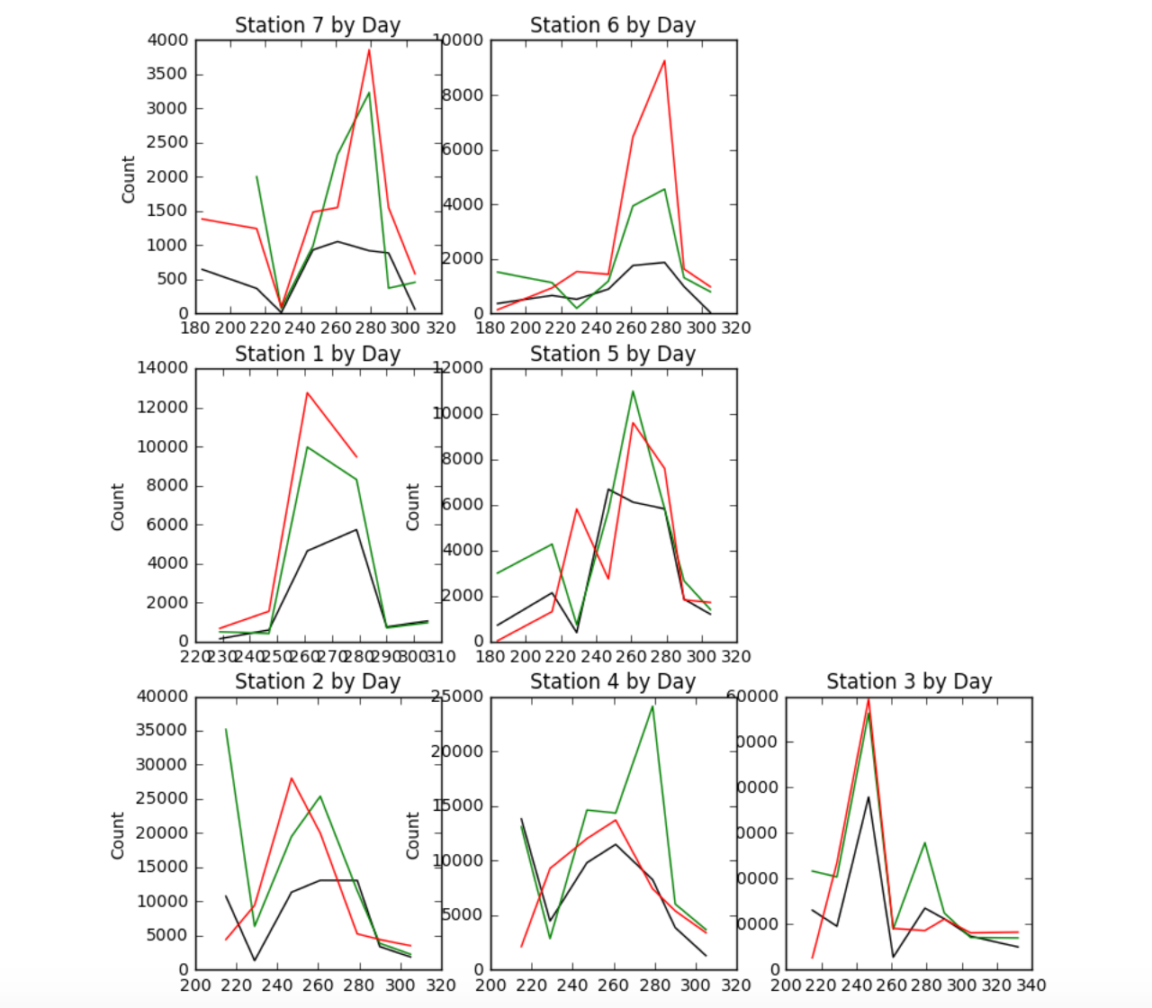
And the result of running the code provided this layout:
For homework, students were asked to refine their code to include features from previous classes or new features from online research and to begin to analyze the data for events, trends, and insights.
With the formatted data, Rob asked students to work individually or in a group to write Python code in a Jupyter notebook in order to create line graphs of population counts by depth layer over time.
Mike came up with a concise, elegant, and efficient routing to create the line graphs. He provided an overview of his solution in class and answered questions facilitated by Rob:
Rob then asked everyone in class to work on arranging the seven location subplot line graphs into a gridded structure that would show the plots in a rough estimation of relative geospatial location to each other. Code that worked to that effect looks like:
And the result of running the code provided this layout:
For homework, students were asked to refine their code to include features from previous classes or new features from online research and to begin to analyze the data for events, trends, and insights.