

Class on October 5 2017
Grace asked if students were able to do the graphs for homework.
Katie suggested that the swap axes didn't work in Excel (it created all kinds of extraneous points).
Grace asked who was comfortable with graph 1 and would be willing to share in front of the class.
Chris suggested that everyone would have to present at some point and that he was very concerned when we break into teams that everyone in each team get the benefit of the exercise and can perform tasks.
Students practiced asking questions of Katie's graph:
Josh went next and showed that his graph had a flatline look to it when done in Excel.
Students had issues getting the swapped axes working in the Graph 2 homework:
Grace walked through graph 3 from the homework - where temperature and pressure could be shown on the same chart (a double-Y chart). She created a combination chart with Excel.
Gavin came to the front of the class to demonstrate how to do it with Google Sheets
Suggestion: We needed a smaller dataset (less dependent-variable values) to start off with graphing if Google Sheets is going to be the free option for students. With a larger dataset, students need the Ah Ha recognition that they can clip (or sub-select) data into a new sheet from the larger dataset before graphing
Graph 4 would appear as seen here if only one day's data (our kayak field trip date) were used: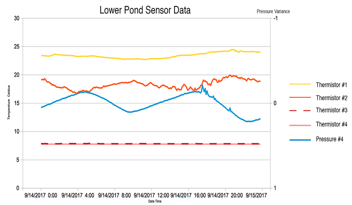
Grace then organized a game while Chris put students in groups. The goal is for students to come up with as many valuable observations about the charts being presented as possible. Kathy would judge whether the observations were worthy of a point or not (the other team can steal when they can improve the observation appreciably).
Some representative observations:
Chris pointed out that the observations in a data report should follow the process of the game.
Lucie asked how you can tell if a sensor is working.
Katie suggested that the swap axes didn't work in Excel (it created all kinds of extraneous points).
Grace asked who was comfortable with graph 1 and would be willing to share in front of the class.
Chris suggested that everyone would have to present at some point and that he was very concerned when we break into teams that everyone in each team get the benefit of the exercise and can perform tasks.
- Gavin went first and showed a graph from September 14th through September 26th.
- Rose came up front second and shared her graph that showed September 14th by hour UTC (her laptop couldn't use any of the available adapters to show in front of the class).
- Katie showed her graph next (after Rose showed her how to present the chart as a separate sheet).
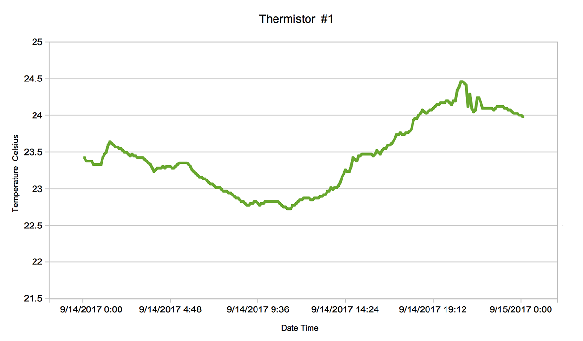
Students practiced asking questions of Katie's graph:
- how long did it take to do the graph?
- why is the lowest temperature the lowest?
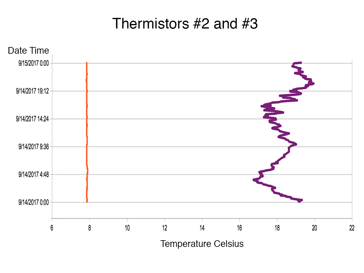
Josh went next and showed that his graph had a flatline look to it when done in Excel.
- Lexi cleaned it up by removing the top cell from the range (since it brought in zero as a value).
- Katie asked why the Y-axis (time) looked so cluttered on the axis? She recommended showing only every four hours on the axis.
Students had issues getting the swapped axes working in the Graph 2 homework:
Grace walked through graph 3 from the homework - where temperature and pressure could be shown on the same chart (a double-Y chart). She created a combination chart with Excel.
Gavin came to the front of the class to demonstrate how to do it with Google Sheets
Suggestion: We needed a smaller dataset (less dependent-variable values) to start off with graphing if Google Sheets is going to be the free option for students. With a larger dataset, students need the Ah Ha recognition that they can clip (or sub-select) data into a new sheet from the larger dataset before graphing
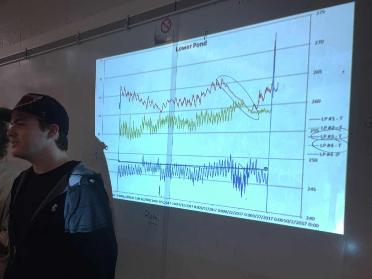
Graph 4 would appear as seen here if only one day's data (our kayak field trip date) were used:
Grace then organized a game while Chris put students in groups. The goal is for students to come up with as many valuable observations about the charts being presented as possible. Kathy would judge whether the observations were worthy of a point or not (the other team can steal when they can improve the observation appreciably).
Some representative observations:
- It appears that temperature fall off from the hurricane correlates to pressure fall off during the same period.
- After a five degree variance pattern before September 22nd, the period between Sept 22 and 27th showed a steadier variance of only a degree hovering around 19 degrees.
Chris pointed out that the observations in a data report should follow the process of the game.
Lucie asked how you can tell if a sensor is working.