

Class on September 28 2017
Downloading data from the moorings — we created three teams of four students in each — two with members of the respective mooring retrieval teams and a third to download the two moorings' sensors near the mouth.
1. Lower Pond Mooring (Emma, Lexi, Gavin, Mike)
2. Upper Pond Mooring (Rose, Jacob, Jasmine, Josh)
3. Mouth & Pollock Moorings (Tayler, Faith, Katie, Rachel)
Students were able to find their HOBO sensors by serial number, extract the HOBO data, and export to CSV (comma separated values) files. They then imported the CSV files to Google Sheets. Some students thought the plots looked strange. For example: the deepest two sensors for the Lower Pond dropped off significantly and appeared to flatline down at the bottom of the plot.
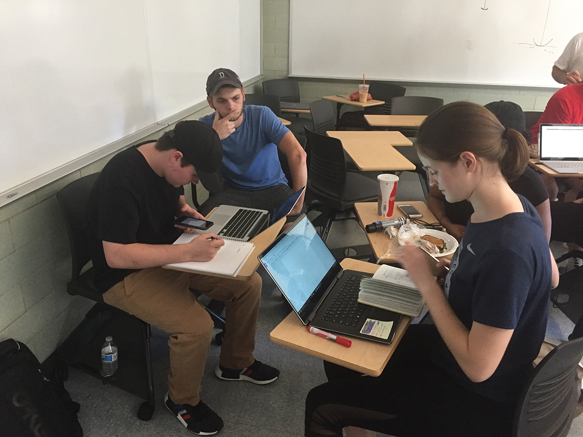
Once the students had a chance to discuss the HOBO plots, they were instructed to add their data to a Google Drive in order to share the data among their team. Students were told to import the raw HOBO data into Google Sheets for plotting and analysis.
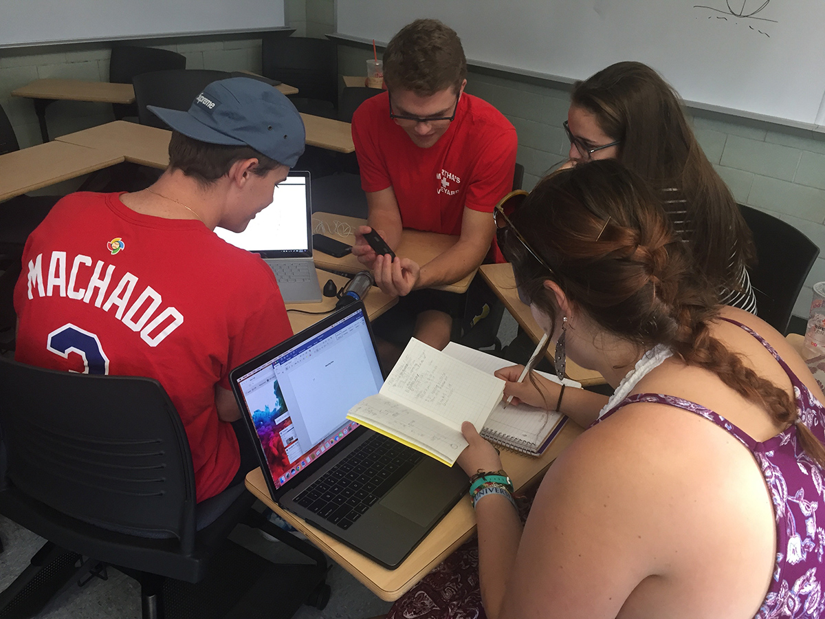
Some students had very little experience with Google Sheets so Rob showed off the results he got for all the HOBOs. A few students had struggled getting multiple HOBO outputs into a single Google Sheets document. Google Sheets took up to ten minutes to finish paste operations.
Rob asked students to look at Patterns, Trends, and Anomalies for the Upper Pond data:
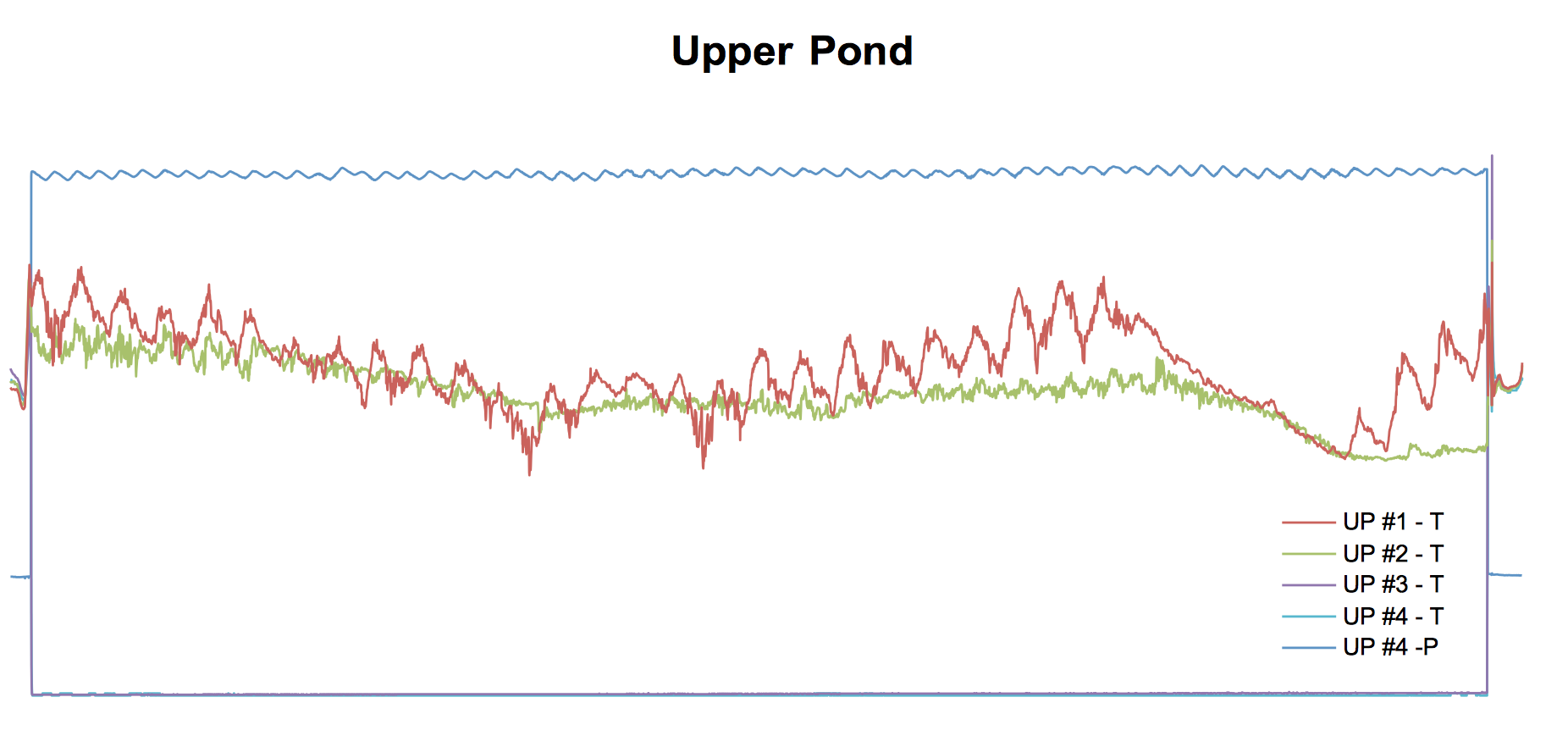
Gavin asked about the effects of rain. Rob suggested it had more to do with fresh-salinity behaviors.
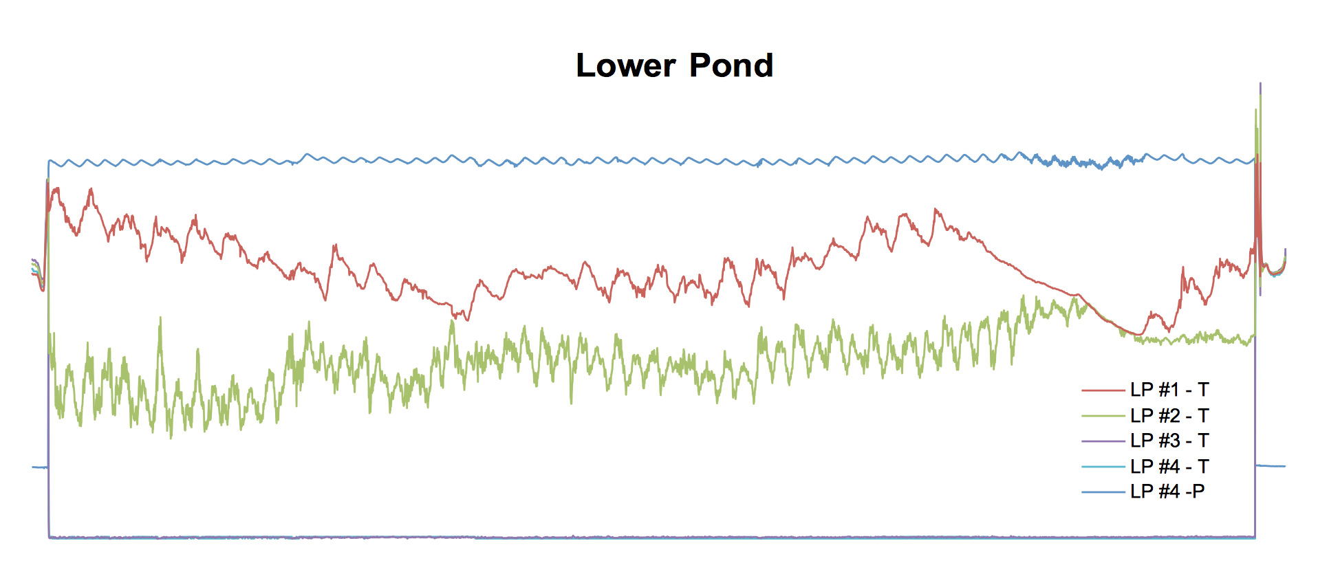
Rob then showed the Lower Pond graph. There was a bigger difference between the top two sensors' temperature. Rob showed how the second thermistor showed tidal effects (and yet the top sensor did not).
Rob pointed out what a great data set we have because there is stratification, mixing, and a hurricane event.
Rob then discussed the data from the mooring at the mouth, pointing out how much more mixed the conditions are at the mouth (as those who paddled down there noticed).
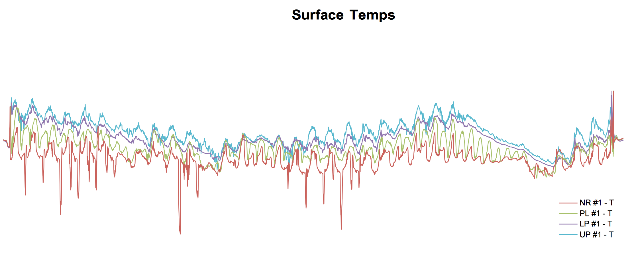
Last, Rob showed off the surface temperature (it was warmer up north - like our correlation of temp v. latitude on our kayak temperature investigations).
Rob asked students to compare different probes as analyses across locations as a homework assignment.
1. Lower Pond Mooring (Emma, Lexi, Gavin, Mike)
2. Upper Pond Mooring (Rose, Jacob, Jasmine, Josh)
3. Mouth & Pollock Moorings (Tayler, Faith, Katie, Rachel)
Students were able to find their HOBO sensors by serial number, extract the HOBO data, and export to CSV (comma separated values) files. They then imported the CSV files to Google Sheets. Some students thought the plots looked strange. For example: the deepest two sensors for the Lower Pond dropped off significantly and appeared to flatline down at the bottom of the plot.
Once the students had a chance to discuss the HOBO plots, they were instructed to add their data to a Google Drive in order to share the data among their team. Students were told to import the raw HOBO data into Google Sheets for plotting and analysis.
Some students had very little experience with Google Sheets so Rob showed off the results he got for all the HOBOs. A few students had struggled getting multiple HOBO outputs into a single Google Sheets document. Google Sheets took up to ten minutes to finish paste operations.
Rob asked students to look at Patterns, Trends, and Anomalies for the Upper Pond data:
- Kati suggested the flatlines looked like an anomaly and suggested that it might be due the hurricane Juan mixing.
- Faith suggested the tides were visible in the two top sensors and the pressure sensor data but Rob pointed out the oscillation was only once a day instead of the twice would suggest. A day-night temperature pattern was more likely (with a delay caused by heaven capacity of water). The pressure sensors had the twice a day pattern and students suggested it would be nice to compare to a tide chart (pressure would be up at high tide and down at low tide).
- Rob pointed out small humps in the data top sensor data. He asked if anyone thought it was caused by tide. Students weren't willing to commit. Rob suggested OSC 250 would provide the analysis technique one could use to look at pressure (tide) effect on temperature.
- Mike pointed out that there was very little movement in the two deepest sensors. Rob asked if they were broken. The upper pond team said no.
- Rachel pointed out that the second from the top sensor fluctuated less than the top sensor.
Gavin asked about the effects of rain. Rob suggested it had more to do with fresh-salinity behaviors.
Rob then showed the Lower Pond graph. There was a bigger difference between the top two sensors' temperature. Rob showed how the second thermistor showed tidal effects (and yet the top sensor did not).
Rob pointed out what a great data set we have because there is stratification, mixing, and a hurricane event.
Rob then discussed the data from the mooring at the mouth, pointing out how much more mixed the conditions are at the mouth (as those who paddled down there noticed).
Last, Rob showed off the surface temperature (it was warmer up north - like our correlation of temp v. latitude on our kayak temperature investigations).
Rob asked students to compare different probes as analyses across locations as a homework assignment.