

Class on October 24 2017
Bruce showed a couple of 4-D data presentation videos and asked for specific feedback from students.
First students watched a virtual drifters video for Rhode Island Sound. Bruce asked:
What do you see (describe it visually)?
to which Rose and Katie answered, "many red dots moving in space".
Bruce then asked if students saw any events, features, or trends of interest.
Jasmine pointed out a counterclockwise rotation of general drifter movement around Block Island
Katie pointed out some locations of dramatic up and down movement, especially near Prudence island.
Bruce then asked:
What insights do you have regarding the data being presented?
Students said "the timing of movement suggests tidal influence".
Katie suggested it would be good to see the data from the north looking south to compare.
No one saw anything that appeared to be attributed to hurricane Floyd so we looked up the date of hurricane Floyd. It had become a tropical storm over 48 hours before the time at the video start.
The students then watched a video of earthquake hypocenter activity at the Axial seamount in the northeast Pacific region. Bruce asked:
What do you see (describe it visually)?
Rose and others answered, "yellow dots growing over time" (they did not suggest shrinking though the shrinking is the longer process).
Bruce then asked if students noticed any events, features, or trends?
Students suggested the number of earthquakes ere growing in number throughout (though when looking closer there are various waves of activity).
Bruce then asked:
What insights do you have regarding the data being presented?
The students noted none of immediate discussion
Bruce cut off the video watching after 25 minutes and asked the students to think about how video could prime the mind to consider a presentation of the same data in a virtual reality theater (as we were going to see in five days). He asked students to ponder how the video experience might have been different if the VR theater exposure came first.
Kathy talked about the castaway data that had been recently collected and how it was obtained (showed a picture of the equipment and compared it to a CTD).
Students were given the data in CSV format and were asked to match individual casts with latitude and longitude of the location where they took place.
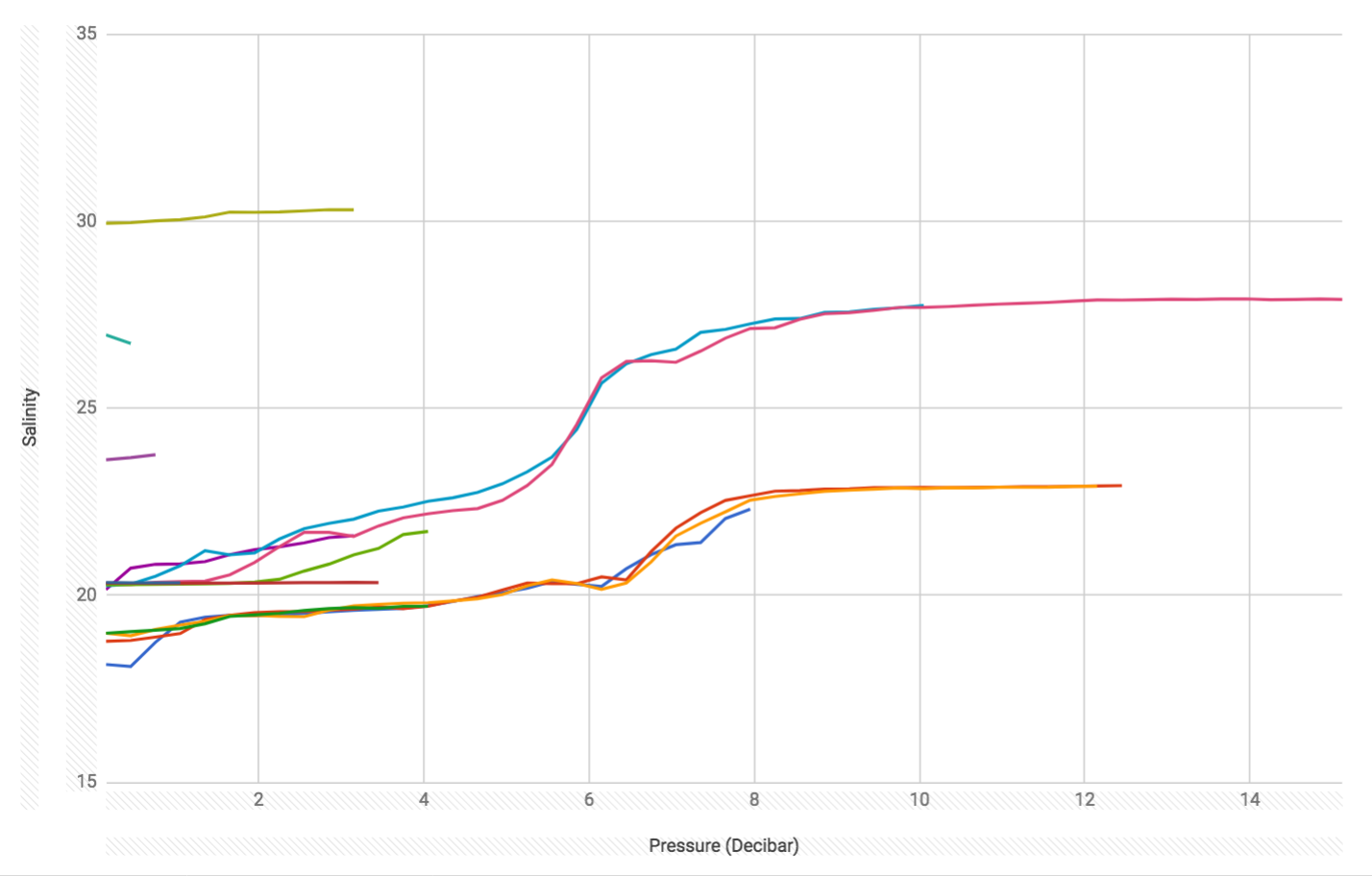
Students were put into pairs of two and asked to graph the data. The following two graphs were generated: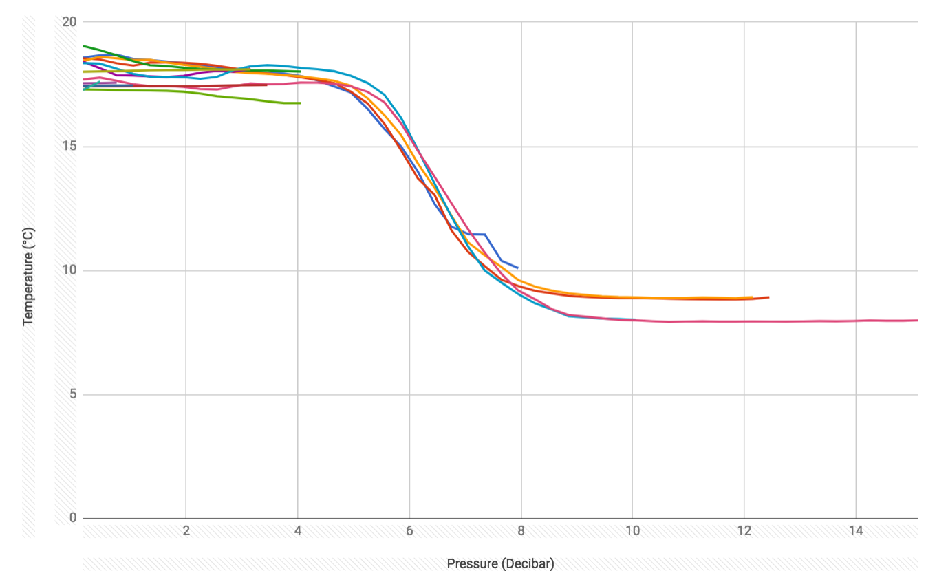
Bruce created a scatterplot of the salinity versus temperature for all depths per location
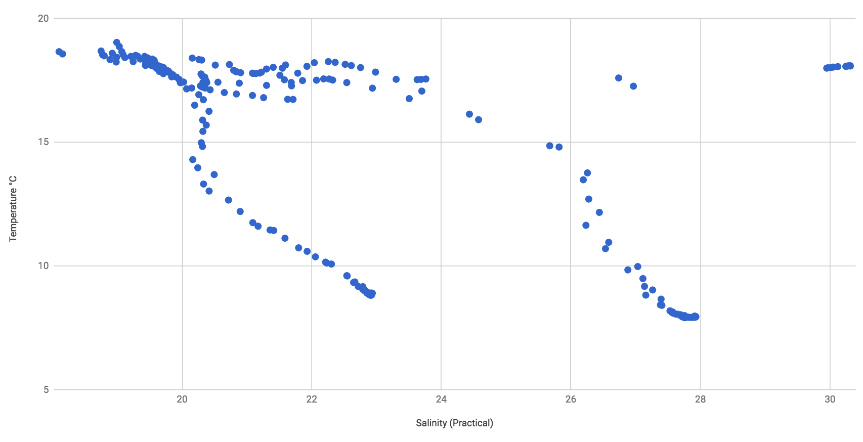
A lively discussion of the graphs followed.
First students watched a virtual drifters video for Rhode Island Sound. Bruce asked:
What do you see (describe it visually)?
to which Rose and Katie answered, "many red dots moving in space".
Bruce then asked if students saw any events, features, or trends of interest.
Jasmine pointed out a counterclockwise rotation of general drifter movement around Block Island
Katie pointed out some locations of dramatic up and down movement, especially near Prudence island.
Bruce then asked:
What insights do you have regarding the data being presented?
Students said "the timing of movement suggests tidal influence".
Katie suggested it would be good to see the data from the north looking south to compare.
No one saw anything that appeared to be attributed to hurricane Floyd so we looked up the date of hurricane Floyd. It had become a tropical storm over 48 hours before the time at the video start.
The students then watched a video of earthquake hypocenter activity at the Axial seamount in the northeast Pacific region. Bruce asked:
What do you see (describe it visually)?
Rose and others answered, "yellow dots growing over time" (they did not suggest shrinking though the shrinking is the longer process).
Bruce then asked if students noticed any events, features, or trends?
Students suggested the number of earthquakes ere growing in number throughout (though when looking closer there are various waves of activity).
Bruce then asked:
What insights do you have regarding the data being presented?
The students noted none of immediate discussion
Bruce cut off the video watching after 25 minutes and asked the students to think about how video could prime the mind to consider a presentation of the same data in a virtual reality theater (as we were going to see in five days). He asked students to ponder how the video experience might have been different if the VR theater exposure came first.
Kathy talked about the castaway data that had been recently collected and how it was obtained (showed a picture of the equipment and compared it to a CTD).
Students were given the data in CSV format and were asked to match individual casts with latitude and longitude of the location where they took place.
Students were put into pairs of two and asked to graph the data. The following two graphs were generated:
Bruce created a scatterplot of the salinity versus temperature for all depths per location
A lively discussion of the graphs followed.