

Class on October 10 2017
Rob started a Powerpoint presentation after putting students in groups as to whether they prefer Google Sheets, Microsoft Excel, or Apple Numbers as a spreadsheet tool.
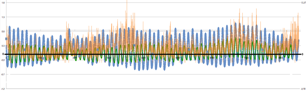
After looking at the lower pond data again, students were given three minutes to come up with patterns, trends, or events they see:
Katie pointed out a general decrease in temperature from 27 to 22 degrees Celsius between August 22nd and September 5th
Gavin pointed out a dramatic shift in pattern and temperature from September 19th to September 24th (from 25 degrees until 19 degrees Celsius
Lexi pointed out a dramatic decrease pressure between September 5th and 6th.
Mike pointed out the regularity of the change in water level between positive and negative water levels (0 being mean tide level)
Rose suggested that oscillation was a pattern like how surface temperature goes up and down once every 24 hours.
Gavin pointed out the hurricane event that is evident in the data.
Rob asked what aspect of the hurricane forced what can be seen?
Rose suggested the surface water mixed with the deeper water (churning).
Rob asked once you identify something, how do you know it is what you are identifying?
Lexi suggested we go to other databases to verify that the forcing agents we think caused the results were actually at levels/values that would cause the results (tides, wind, air temperature, precipitation).
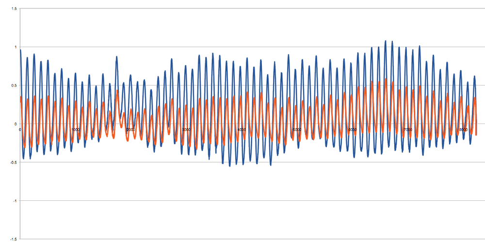
Students worked in groups to each create a graph with two Y-axes (on separate scale bounds) to show off data from the Narragansett Beach HOBO sensor compared to tide data retrieved from the NOAA PORTS website
Students then charted the calculated water level for the Narragansett Beach HOBO (orange) along with the Newport tidal station data (blue) for August 23 through September 23:
Students then charted the calculated water level for the Lower Pond HOBO (orange) along with the Newport tidal station data (blue) for August 23 through September 23:
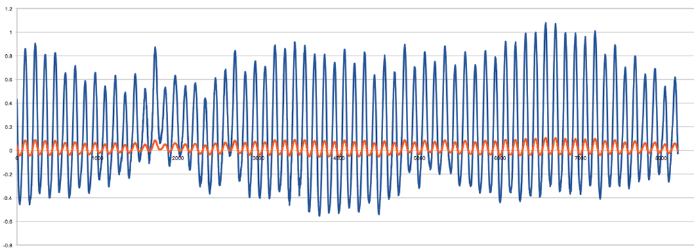
Students then charted the calculated water level for the Upper Pond HOBO (orange) along with the Newport tidal station data (blue) for August 23 through September 23:

Students acknowledged the visual evidence that the tide magnitude decreased as a mooring was placed further up the Narrow River.
Rob demonstrated a scatter plot of lower pond water level against the newport tide water level.
He demonstrated how to use Google Sheets to look at the tide phase between upper pond and Newport (showing a phase shift of about 3 hours).
Course 250 in the PODS sequence provides more elegant tools for investigating tidal movement into an estuary.
After looking at the lower pond data again, students were given three minutes to come up with patterns, trends, or events they see:
Katie pointed out a general decrease in temperature from 27 to 22 degrees Celsius between August 22nd and September 5th
Gavin pointed out a dramatic shift in pattern and temperature from September 19th to September 24th (from 25 degrees until 19 degrees Celsius
Lexi pointed out a dramatic decrease pressure between September 5th and 6th.
Mike pointed out the regularity of the change in water level between positive and negative water levels (0 being mean tide level)
Rose suggested that oscillation was a pattern like how surface temperature goes up and down once every 24 hours.
Gavin pointed out the hurricane event that is evident in the data.
Rob asked what aspect of the hurricane forced what can be seen?
Rose suggested the surface water mixed with the deeper water (churning).
Rob asked once you identify something, how do you know it is what you are identifying?
Lexi suggested we go to other databases to verify that the forcing agents we think caused the results were actually at levels/values that would cause the results (tides, wind, air temperature, precipitation).
Students worked in groups to each create a graph with two Y-axes (on separate scale bounds) to show off data from the Narragansett Beach HOBO sensor compared to tide data retrieved from the NOAA PORTS website
Students then charted the calculated water level for the Narragansett Beach HOBO (orange) along with the Newport tidal station data (blue) for August 23 through September 23:
Students then charted the calculated water level for the Lower Pond HOBO (orange) along with the Newport tidal station data (blue) for August 23 through September 23:
Students then charted the calculated water level for the Upper Pond HOBO (orange) along with the Newport tidal station data (blue) for August 23 through September 23:
Students acknowledged the visual evidence that the tide magnitude decreased as a mooring was placed further up the Narrow River.
Rob demonstrated a scatter plot of lower pond water level against the newport tide water level.
He demonstrated how to use Google Sheets to look at the tide phase between upper pond and Newport (showing a phase shift of about 3 hours).
Course 250 in the PODS sequence provides more elegant tools for investigating tidal movement into an estuary.